

Signal the Genre
Use familiar visual cues so the right reader understands the type of book without making the cover generic.
A strong cover should signal genre, tone and quality before a reader opens the first page. Build a visual identity that works at thumbnail size, on a retailer page and in print.
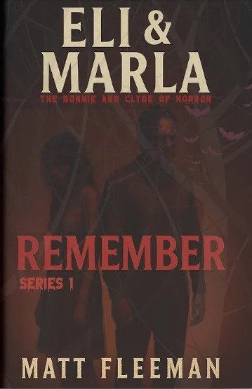


Readers make quick visual judgments. The goal is not simply to make a cover attractive; it is to make the design feel credible for the book, clear at a glance and distinctive enough to be remembered.
Use familiar visual cues so the right reader understands the type of book without making the cover generic.
Balance title, author name and imagery so the most important information reads immediately.
Make the cover effective as a thumbnail, a digital product image and a physical book.
Account for trim, spine, bleed and format requirements when a print edition is part of the project.
Selected published titles from the Uptown portfolio provide real context for how different genres, audiences and formats can demand very different visual approaches.
Portfolio images shown here represent published-work context. Specific project service credits should only be shown where the exact scope is verified.
Explore Published Work →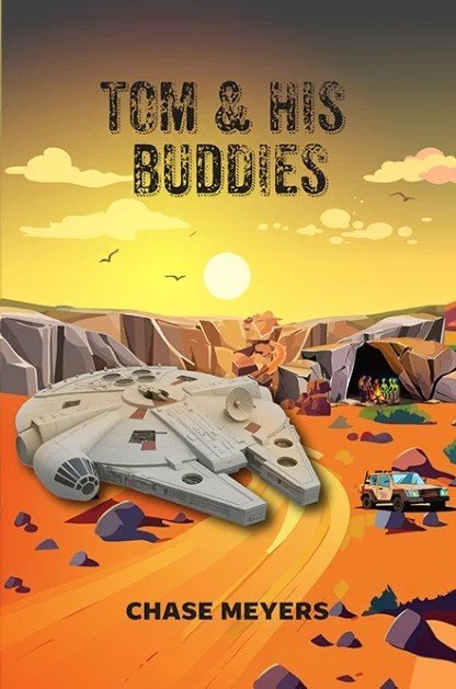

The scope can stay focused on a single front cover or expand into a full print wrap, a connected series system or a strategic redesign.
A focused visual concept for the title, author name, genre and key imagery.
Front, spine and back coordinated around the final trim and production specifications.
A clean front-cover asset designed to remain clear and compelling at retailer thumbnail size.
A connected cover language that helps multiple books feel like one recognizable collection.
A stronger hierarchy or new creative direction for a book that already has a cover.
Prepare or adapt the cover around the selected publishing and print requirements.
Genre is one of the fastest signals a cover sends. The design process should understand those expectations, then decide where the book should follow convention and where it should stand apart.
Human, intimate and credible.
Atmosphere, tension and narrative intrigue.
Authority, clarity and a strong promise.
Immediate character, warmth and visual energy.
World, scale and genre recognition without visual clutter.
Keep the creative process structured enough to move forward without turning every revision into a new direction.
Understand the story, audience, genre, format and references.
Define the visual territory and strongest creative route.
Build the cover hierarchy, typography and image treatment.
Use focused feedback to strengthen the selected direction.
Deliver assets around the agreed digital and print requirements.
A beautiful image alone does not make a professional book cover. The typography must be readable, the composition must survive at small size and the production file must match the format being printed or distributed.
Your name, phone number and email are the only required fields. If you already know the genre, book title or print format, you can add that information as optional project context.
Prefer to talk? 332-264-9264A clear brief at the beginning saves unnecessary redesign later.
Yes. The project can be prepared around the formats you need. A print edition may require a full wrap with front, spine and back, while an eBook typically uses the front cover artwork.
Yes. References are useful for communicating genre, tone and expectations. They guide the conversation without forcing your book to copy another title.
A strong starting brief usually includes the title, author name, genre, short book description, audience, format requirements and any references or visual restrictions you already have.
Yes. An existing cover can be reviewed for hierarchy, typography, genre fit and production readiness, then refreshed where a stronger direction is needed.
Yes. Series work can use a shared typography, layout or visual system so each title feels individual while clearly belonging to the same collection.
Yes. Publishing support is available separately for production files, ISBN guidance, formatting and release preparation.
Start with the title, genre and what you want a reader to feel before they open the book.
Your final live-chat provider will appear here. Until then, this fallback captures a normal website inquiry.